Introduction
This summer, at Be API, we started an internal project Blocks party in order to create a collection of Gutenberg Blocks complementary to the list of native WordPress blocks. These blocks will be made-house, and will of course also be open-source to stay true to WordPress DNA.
First, we identified the most recurring formatting / functionality in our projects, from which we produced a list of candidate blocks for development. Without knowing it, I was going to start with the most difficult and complex block on the list.
I am Paolo Tesei, developer of WordPress themes for 15 years, and I propose you below a return to experience on the creation of my first native Gutenberg block.
A steep course
Everything is difficult when you start something new!
To get off to a good start, used package create-block WordPress to initialize the project, in the form of WordPress extension. I then added nos code standard usual for JavaScript, CSS and PHP languages, then I passed in mode Multi-blocks (an extension to record multiple blocks at times).
Personnellement, j’avais déjà commencé à prendre mes marques avec React en développant un site sous Gatsby.js. Avec Gutenberg l’expérience est similaire, comparable au développement à l’aide d’un Framework JavaScript : adapt to its rules and how it works.
To start well, the documentation (which, to date, is not yet optimal) remains the first piece of the puzzle, although it is not yet many examples. To compensate for this lack, since everything is in open-source, it is easier to find and go take a look at the use that other developers could make of it (and to see, or not, if they also fell into the same traps as me).
Cause of evil
The first block the project team decided to develop was the "Tabs" block. Very requested/used in our projects, it is a composite block a bar of tabs (tabs list) and content panels (panels) with a small bonus allowing the user to choose an icon for each tab.
As we had already developed a "Icons" block that allows to load icon collections, I preferred to exploit the systeminnerBlocks native (interlocked blocks) to fully respect the concept of modularity and independence of functionality, rather than transforming this block into a component.
The "Tabs" Block
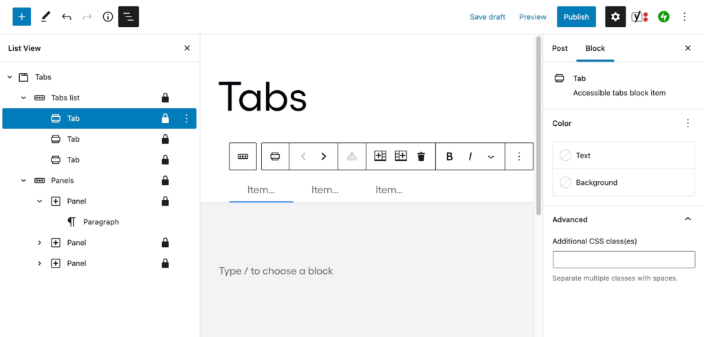
After a few days of trying to design this block from a single child block, I finally realized no less than 4 to make the block in the most logical and coherent way!
To be more precise, in this block "Tabs", we find the first two blocks of level 1, one that contains all tabs (tabs list) and another that contains all panels (panels). The children (level 2) of the latter are synchronized, which means that if I move the first tab (tab item) in second position, the content (panel item) will monitor and position in the same order in the list of panels.
In this phase, the most difficult was to understand how to make the blocks speak between them. In Gutenberg, basic, each block lives its life, but there are several solutions to allow these blocks to interact. Of course, each of these methods had to be tried to determine which would be the most effective. So I used contexts (Redux equivalent for Gutenberg) and on Select and Dispatch to retrieve the data from the block register. Another path was to create a Store dedicated, but it was clearly an oversized solution, so quickly abandoned.
Small constraint (and trick): Throughout the development phase, the block is often broken (as often as the development logic is changed) and a regular contribution is needed to do it (re)function. Passage forced, the message "This block has encountered an error and cannot be previewed." becomes your best friend. As the message is not very explicit, it is not obvious where the error comes from. I therefore recommend that gradually develop and test continuously to avoid too much frustration due to too much change!
If in the majority of cases the error comes from a change of markup, this feature (no no, it's not a bug) highlights the fragility of the blocks. So it's important to keep in mind that if you make your block evolve in the future, its backward compatibility must be taken into account.
We started by establishing (for this block, but also for the following ones) General naming rules to prefix our blocks, our classes and CSS variables and the namspace of our plugins.
To make the assembly more flexible and developing-friendly, we made it possible to set up what types of blocks we can add inside the tabs (tabs) and the content area (panels), with list of authorized blocks (allowed blocks).
Overall, we need to think about how to make each block enough flexible and open to interact with other ecosystem extensions/blocks.
In parallel, there is also a need to ensure that between the interface effective, to offer the less experienced contributors only the options that will be useful to them, or simply to adapt the edition of the block to a well-structured artistic direction.
For the "Tabs" block, I disabled the editing of certain elements (locking) for avoid contribution errors and I also made it possible to limit and customize the list of possible alignments.
By changing the configuration of the blockSupport, it is also possible enable or disable the display of native options like color selector or margin management.
A final source of reflection is the CSS. In preparation for the massive arrival of the ESF (Full Site Editing, rather Site editor (renaming recent)), one must identify what are the style settings that allow to edit the visual aspect of the block, and then create associated CSS variables.
The three rules
In the classic theatre of 1500 inspired by Aristotle, the perfect play was to be designed according to the following three rules:
- Unit of time : everything must be within a day;
- Unit of place : everything must take place in the same places/spaces;
- Unit of action : all the main events necessary for history must begin and end inside the room.
I found it quite fun to be able to apply these « Aristotelic units" in the development of Gutenberg blocks.
Time unit.
The life of a block stretches from a publishing phase (edit) at a backup stage (save), and These two phases are intimately interconnected. It is fundamental to make the editing interface true to front-office rendering. This is particularly true when developing a block that does not have a dynamic rendering. The markup of its part save also imposes the structure of its part edit.
Place unit
This concept is important for modularity: when all the features cannot be carried by a single block, we are forced to break it down in a parent structure > children. This rule is imposed by the fact that in a Gutenberg block we have the right to use a single innerBlock. For example, the native block "Buttons" (a wrapper) innerBlock) is a parent of the native "Button" block.
Unit of action
All manipulations modify the attributes of the block simultaneously. So we have to try to prioritise a certain order of interaction to enable the most logical and natural contribution possible:
- page content (editor)
- in the toolbar (toolbar) or access these main settings
- in the sidebar (sidebar) or we find his options more advanced.
Conclusion
Even though at first the implementation was a little complicated, I took great pleasure in creating this block.
By studying native blocks more closely (core blocks) of WordPress, I became aware of the care and important reflection behind each block, as well as the quantity and quality of work that there is behind the Gutenberg project.
For everything I learned/discovered, hat low and thanks to the community!