Since 2018, the world of WordPress has experienced a major turning point with the introduction of Gutenberg, a block editor intended to replace the classic publisher. The tool is a real revolution within WordPress first, but also and especially in the CMS world with a completely redesigned content editing mode. Despite some criticisms at its beginning for its complexity, Gutenberg has now become a solid and indispensable tool of the WordPress ecosystem. As we talk more and more about the Full Site Editorial, This article offers both a review of what Gutenberg has become after several years of evolution and a tutorial to master its uses. Whether you are a beginner, a curious user or used to WordPress, this guide will help you to take charge of this publisher effectively, with the best practices 2025.
How to install and use Gutenberg?
Since WordPress 5.0, Gutenberg is default editor integrated into the heart of WordPress. In other words, you already use it as soon as you create or edit an article or page in a recent CMS installation. But there is also a more recent/evolved version as a plugin.
Native Gutenberg
With the built-in version of WordPress, no installation is required. It's the version. « stable », tested and validated with each new version of WordPress. The major innovations of Gutenberg arrive here (integration into the heart of WordPress) once they are sufficiently tested.
Gutenberg via the official plugin
You can install the plugin Gutenberg from the official directory. The objective? Access in advance to Experimental features and latest developments by the publisher.
Ideal for developers, testers, or those who want to explore the future of WordPress before everyone else.
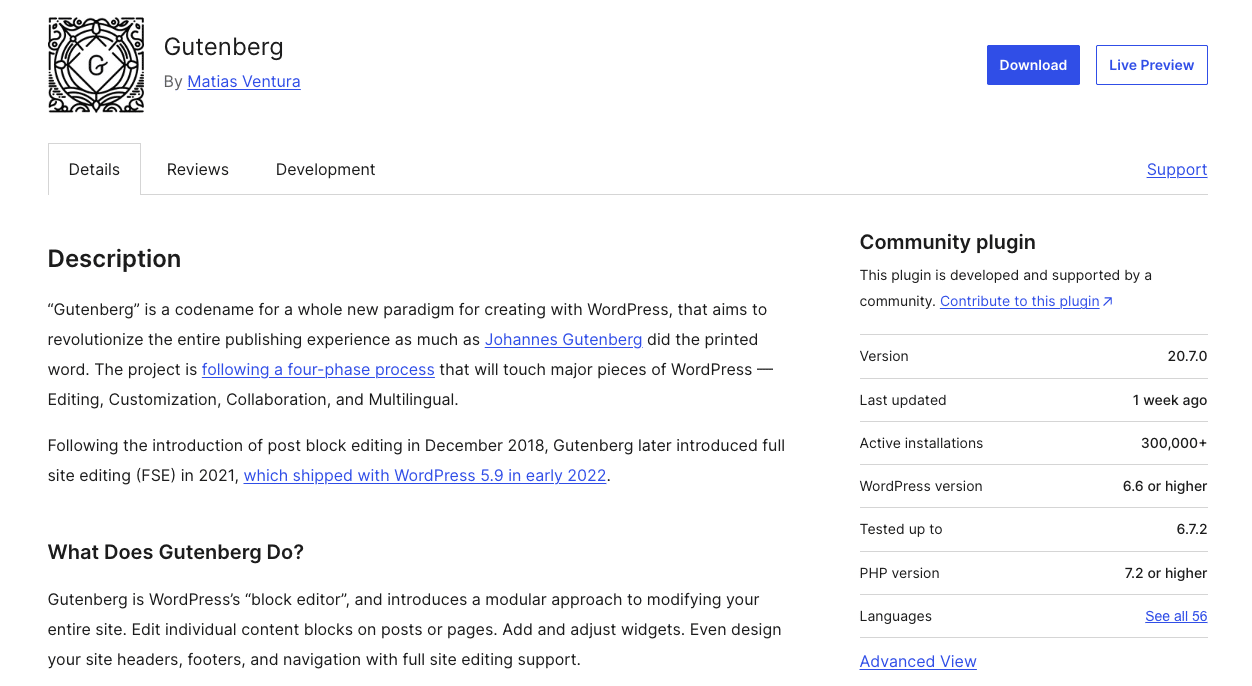
To install the Gutenberg plugin:
- Go into the WordPress dashboard.
- Click Extensions > Add.
- Search "Gutenberg".
Click Installthen Enable.
👉 ATTENTION : The Gutenberg plugin may sometimes include unstable or uncompleted functions. It is not recommended to use it in production without prior testing.
Use Gutenberg well in 2025
Editor interface
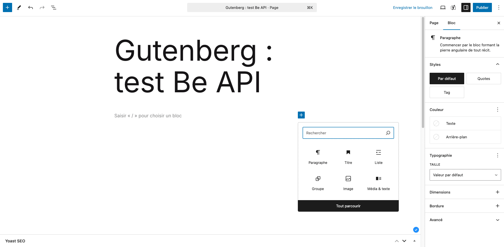
Although it may seem confusing at first glance (white page syndrome), Gutenberg's interface quickly becomes logical and simple to use once the main elements are known:
- The central area This is where you write and build your content. Each line, image or layout comes to life, block after block.
- The "+" button (Add block) : you will find it at the top left of the editing window, but also between two existing blocks. This is the key to insert new content in your page or article (text, image, buttons, columns...).
- The right sidebar : it includes the tab Bloc, which displays the options of the selected block (alignment, color, typography, margins...). Tab "Document", ui, contains the global settings (categories, featured image, publication status, etc.).
- Current block list (structure icon at the top of the content area) : very useful for navigating quickly in a complex page with nested groups, or even doing quick actions on blocks in an isolated or grouped way (grouping, duplication, displacement, deletion).
Basic use
To start well and create a basic page (or article), here is a suggestion of common blocks and their usefulness.
| Page title This is the first block automatically present. It is mandatory, serves as h1, and is essential for SEO. |
| Paragraph block : default block is the heart of your text content. It can be stylized (gras, italics, colors, size...) in the block settings in the right side bar. |
| Title Block : allows to cut its content into defined and understandable sections, thanks in particular to the various levels of title available (h2 to h6). More precisely, the titles give meaning to the content they encompass and consistency to the entire content of a page or article. A ++ block to optimize SEO but also accessibility of your content. |
| "Image" Block Add an image from the media library or your computer. Here too, settings can be used to define size, alignment, style (form or color effect), or to add a link. |
| List Block : perfect for structuring information (ordered or unordered list, steps...). |
| Button Block : you can customize its text, color, link and style for an CTA (Call to action) effective. |
👉 PRACTICAL STUDY : Directly in the editor, type "/” followed by the name of the block ("/image", “/list", etc.) to add it even faster.
Advanced use
Once the interface is understood and the first blocks are laid, you will want to go further to discover the many possibilities and the power of the publisher. To save you some time, here is a focus on some useful and natively integrated features.
Page layout blocks:
Native content blocks are numerous and relevant, but two layout blocks leave a lot of creativity and will be very useful for create advanced and original layouts quite easily :
| Group Block : allows you to group blocks in order to handle them easily, but also and above all to apply a common background or style to several blocks in one manipulation/manoeuvre (e.g. a quotation box with a coloured background). |
| "Columns" block : allows you to create grid layouts (2, 3, 4 columns, or customized). Each column may contain different blocks |
Embedded content blocks (embed)
Gutenberg has been proposing for a very long time the integration of content from third party services in blocks. Among the best known are Youtube, Vimeo, Spotify, Tiktok and Bluesky.
These blocks allow you to add interactivity to your pages and also create a direct link to your various accounts and social profiles.
👉 WARNING : These blocks are to be used sparingly because the code they generate can have a fairly significant impact on both performance, but also accessibility of a page and a site.
Ex of good practice: it is better, if possible, to favour a link to the external resource on the original platform. (e.g. link to Youtube video, map or Spotify playlist)
Dynamic blocks
Many dynamic blocks have been created in Gutenberg's latest evolutions, making the contribution ever more powerful and relevant. These blocks allow you to create internal mesh within your site, and optimize the relevance and referencing of your content.
| "Quiet Ring" Block : allows to display a list of content of the site (pages or articles) by customizing the request (type of content, number, order, various filters) and the content and visual rendering of this content loop |
| Content metadata blocks : allows to display metadata specific to content such as title, summary, author, date, image, or taxonomy. |
Compositions
One composition (or pattern) is a assembly of pre-built blocks which quickly adds a visual structure or reusable layout to your pages or articles, without having to recreate everything every time.
👉 EXAMPLE : a "Customer Testimonials" section with stylized quotes, or a header with image, title and button... All this can be recorded and reused as a composition.
Like the blocks, the compositions are accessible from the "+" button at the top left of the editor, then via the "Compositions" tab. Use them to add sections well Designed in one click: gallery, testimonials, service grid, etc. You can also create your own compositions and reuse them as internal templates.
By default, the layout and content of the compositions are not synchronized. Once the composition is added to your page, you can totally customize the initial layout and content, without affecting other occurrences of the same composition used in other pages or articles.
👉 BENEFITS :
- Time saving : no need to recreate the same layout indefinitely and manually. The compositions allow you an optimized and efficient contribution.
- Visual consistency Your contributions and layouts are always aligned with your graphic chart.
- Less errors your contributors use ready-to-use blocks and save time.
- Structured creativity : you offer powerful tools without falling into the effect "site spaghetti"
Synchronised compositions (ex "reusable blocks")
To go further, it is quite possible to Synchronize compositions directly from the backoffice (option to activate on your initial composition). When recording your synchronised composition, you will have to give a unique name to your synchronized composition.
So, once added, if you change this composition, changes in layoutbut also of contents, will automatically apply wherever this composition is used (all occurrences). It is therefore better to appoint them to creation to find them easily and avoid confusion.
👉 EXAMPLES : A synchronised composition use may be relevant for a promotion banner, signature or repeated FAQ.
Customize Gutenberg Editor
Adapt the interface to your needs
One of Gutenberg's assets is its modularity. Whether you are a developer, designer or simple user, you can adapt editor your workflow, your visual identity or your publishing preferences.
Customizable interface for users
- Hide unnecessary blocks : in the three-point menu at the top right > "Preferences" > "Blockboard", you can disable blocks you never use, to lighten the interface.
- Reorder the sidebar : in the preferences also, you can choose whether or not to display the options of the document, navigation in the structure, etc.
- Fullscreen or reduced layout mode : alternate according to your reading or writing comfort.
- Mode without distraction : hides menus to focus on writing.
For developers: Advanced customization
- Adding or deleting blocks via code (with remove block type, register block type...). This makes it possible to standardize the list of available blocks for all contributors. (official documentation)
- Control of available options by block (colours, typography, alignments...) with the block supports. (official documentation)
- Creating color palettes or global styles thanks to the complete site editor (theme.json), which allows centralizing design choices for all blocks. (official documentation)
💡 COUNCIL : If you work as a team, a consistent customization of the editor (via the theme or plugins) guarantees a homogeneous experience for all editors and limits layout errors.
Add blocks and third-party compositions
If you can already do a lot of things with native blocks, your needs may sometimes require Use of third party blocks or compositions.
Still in the opensource spirit of the WordPress project, users of the tool, via WordPress.org, can put and already make available blocks and compositions created by and for all. From the backoffice of your site, you can browse the existing blocks and compositions and install them for use on your site:
- The repository of block plugins:https://wordpress.org/plugins/browse/block/
- Deposit of compositions: https://wordpress.org/patterns/
💡 WARNING : There are also plenty of plugins (often premium) dedicated to adding many Gutenberg blocks. If these plugins can sell dream and indeed be very practical, they can also create a rather heavy dependence on an external solution and create an important technical debt on your site/project in case of bug or non-maintenance of this plugin. To be installed/used with knowledge.
Add Custom Blocks
If the Gutenberg native blocks, plus those provided by the community, do not meet all your needs, it is possible to create custom blocks, corresponding to your needs and your site.
At Be API, we identified, among other things, recurring needs of our clients on our projects and therefore created specific blocks to address these needs.
| Onglets (tabs) : Quite classic presentation of content in tab form, allowing to contribute and classify a good amount of content without creating page extensions. This block also manages the positioning of tabs (horizontal, vertical) but also the alignment of these tabs (left, center, right) |
| Accordion block (agreement) : Here too, a fairly classic presentation of content with the same objective as the "Onglets" block (classify content, control page length), but with a different presentation, and a system of opening/closing whose name of the block gives a fairly explicit idea of visual rendering. |
| "FAQ" Block This block is similar to the "Accordion" block, with an automatic marking using structured data (invisible to the user) allowing search engines to identify and highlight the most frequently asked/consulted questions/answers. |
| Key Box (keyfigure) : Block allowing to highlight key numbers with advanced parameters allowing the management of several parameters such as the main encrypted value but also a suffix, a prefix, and animation parameters of this number. |
| "Icone" block (icon) : Very practical/used block allowing to add icons (SVG and therefore qualitative) to your pages, including in some blocks above (Titles of tabs of block "Onglets" or items of block "Accordion"). The parameters of this block allow to choose its color, its size and also to select icons by collection (grouping icons by logic of use) |
| "Table of Contents" block (table of content) : Block allowing to build an automatic summary based on the title levels contained in a page. This block allows to customize the levels of title to be traced back to the summary, but also to incorporate elements specific to the summary. Finally, it is possible to return this sticky summary to the scroll and to highlight the current summary item (title displayed on screen on the scroll) |
| Block "Dynamic/Manual Content Picking" : This block was built to fill the need to be able to display dynamically any type of content in the form of lists of clickable cards, lists that can be presented in grid mode, carousel, slider. It is also possible to choose the total number of content to display, the number of content to display per line, activate pagination, filter by taxonomy. There is a manual variant allowing you to manually search for the contents to be traced. Today, this need is almost met by the native "Buckle of query" block, which is not yet as permissive as this block in terms of parameters. |
| Plugin "Mega menu" : An almost systematic need on our projects. This plugin allows you to manually build rich and complete menus. The solution is based on the native menu system to WordPress, coupled with the management of mega menus via predefined patterns. A powerful, flexible and fully integrated solution to Gutenberg (and ESF). |
The creation of our own collection of blocks allowed us to put our best code practices (coding standards) but also a good dose of SEO, accessibility and performance, also ensuring a good level of graphical customization (compliance with project/site charter) but also the evolutionary code allowing maintain and evolve these blocks fairly easily.
Optimize content with Gutenberg
Creating visually attractive content is good — But still must it be visible, accessible, and quick to load. Gutenberg offers several native (or easy-to-integrate) levers to treat these three pillars.
SEO (natural reference)
Even without SEO plugin, Gutenberg allows, basic, structure content properly, which greatly helps search engines.
✅ Here are some good SEO practices to adopt in Gutenberg:
- Hierarchy the titles with the Title block (H2, H3...) :
Put only one H1 (that of the main title of the page). Use H2 for large parts, H3 for subsections, etc. - Fill in the ALT attributes of the images :
The "Image" block allows to add an alternative text, important for the image SEO and accessibility. - Use List, Quote and Table blocks wisely :
The generated HTML tags are semantic, which facilitates Google analysis. - Add internal and external links :
Via the "Paragraph" or "Button" block, insert links with clear anchors.
You can set if they open in a new tab or not. - Compatibility with SEO plugins :
Yoast, RankMath or SEOPress fit perfectly into Gutenberg, displaying a SEO real time evaluation in the sidebar or under the editor.
Accessibility
Gutenberg regularly progresses on this field, and well used, it produces content meeting accessibility standards.
✅ Good practices to respect the accessibility of your content:
- Use native blocks instead of paste complex HTML :
Blocks such as "Bouton", "Image" or "Table" generate a code according to good accessibility practices. - Describe the images (ALT attribute) :
The alternative text field must be concise, relevant, and avoid repetitions ("photo of...", etc.). - Colour contrasts :
In the block settings (Styles tab), Gutenberg warns if background and text colors lack contrast. - Keyboard navigation :
Check that your content is accessible on the keyboard (including forms and buttons).
Performance
Unlike some page builders, Gutenberg does not add significant overload Front-end. However, some good practices are needed to keep pages light and fast.
✅ Some tips to optimize the performance of your pages:
- Limit the use of complex blocks (carousels, integrated maps) unless necessary.
- Compress your images :
Use tools like TinyPNG, Squoosh to do it before uploading to your site or a dedicated plugin like ShortPixel or Imagify to do it for you at uploading images in the media library. - Maximum preference for text/image blocks with heavy embeds (iframe, video or social widgets) :
For example, an embedded YouTube video can slow down loading. Use the lazy load option or insert a link to the video rather than a direct embed. - Choose an optimized theme for blocks :
Modern ESF themes are lightweight and designed for Gutenberg.
Enable cache and CSS/JS optimizations :
Use dedicated plugins like WP Rocket, LiteSpeed Cache, or FlyingPress.
Conclusion
Gutenberg has come a long way since his beginnings. What was initially only a technological bet is today a robust, versatile and deeply rooted tool in WordPress's future vision. Even though there are still aspects that can be improved, Gutenberg is now an essential standard, able to replace the majority of page builders in many projects. It allows users to truly take over their site, while maintaining optimal performance and consistency with the WordPress ecosystem.
If you haven't jumped yet, it's time: Gutenberg is no longer an option... This is both the present and the future of WordPress.